Lamborghini gets new logo and corporate identity
31 Mar 2024|684 views


Lamborghini is revising its logo, after more than two decades since giving it its last update.
The new logo will now be utilised on all the firm's official channels, and gets a new broader typeface alongside new colours that are described as 'minimal yet bold'. The firm's new typeface is said to echo the lines and angularity of the brand's cars and will be used for the company's communications.
Black, white, and yellow have been reconfirmed as the brand's primary hues, while the use of gold has now been adopted as a new accent colour. Lamborghini states that this new colour will become an integral part of the company's distinctive identity and will also be applied on future cars.
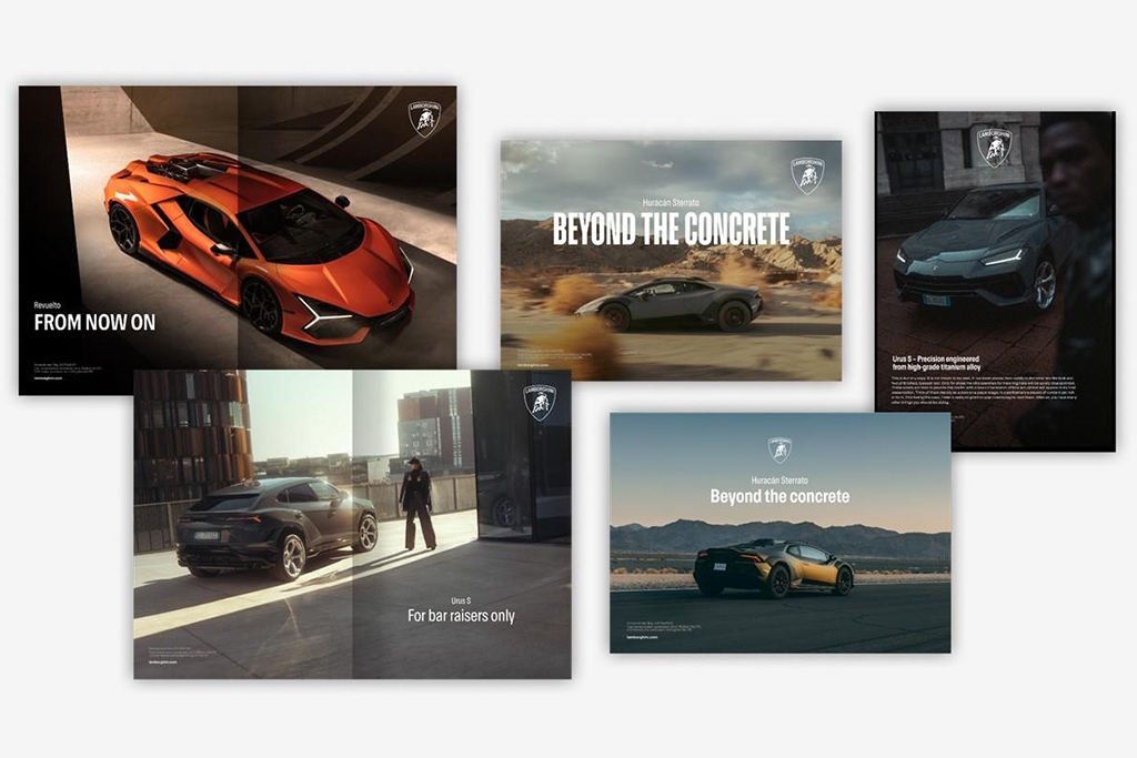
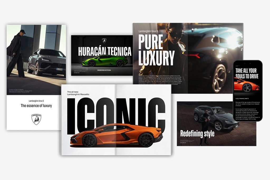
Lamborghini is adopting a new typeface which is said to echo the lines and angularity of the brand's cars alongside its revamped logo
The firm's iconic bull in the centre of the logo has also been retouched so its bright gold is now replaced with a more subtle shade of bronze. More significantly, the bull will can now appear separate from the firm's shield on the company's digital touchpoints, a move said to have been adopted to give it greater prominence.
Lamborghini states that the new logo has been adopted to better reflect its transformation denoted by its Direzione Cor Tauri strategy, which will see the firm embarking on a new trajectory focused on sustainability and decarbonisation.
Lamborghini is revising its logo, after more than two decades since giving it its last update.
The new logo will now be utilised on all the firm's official channels, and gets a new broader typeface alongside new colours that are described as 'minimal yet bold'. The firm's new typeface is said to echo the lines and angularity of the brand's cars and will be used for the company's communications.
Black, white, and yellow have been reconfirmed as the brand's primary hues, while the use of gold has now been adopted as a new accent colour. Lamborghini states that this new colour will become an integral part of the company's distinctive identity and will also be applied on future cars.
Lamborghini is adopting a new typeface which is said to echo the lines and angularity of the brand's cars alongside its revamped logo
The firm's iconic bull in the centre of the logo has also been retouched so its bright gold is now replaced with a more subtle shade of bronze. More significantly, the bull will can now appear separate from the firm's shield on the company's digital touchpoints, a move said to have been adopted to give it greater prominence.
Lamborghini states that the new logo has been adopted to better reflect its transformation denoted by its Direzione Cor Tauri strategy, which will see the firm embarking on a new trajectory focused on sustainability and decarbonisation.
Latest COE Prices
April 2025 | 1st BIDDING
NEXT TENDER: 23 Apr 2025
CAT A$97,724
CAT B$117,899
CAT C$68,782
CAT E$117,002
View Full Results 
Thank You For Your Subscription.


